Arco “Rewards Center”

Arco “Rewards Center”

Arco “Rewards Center”

Art Dept Manager | Set Builder

Ancient Order

2025

Project Synopsis

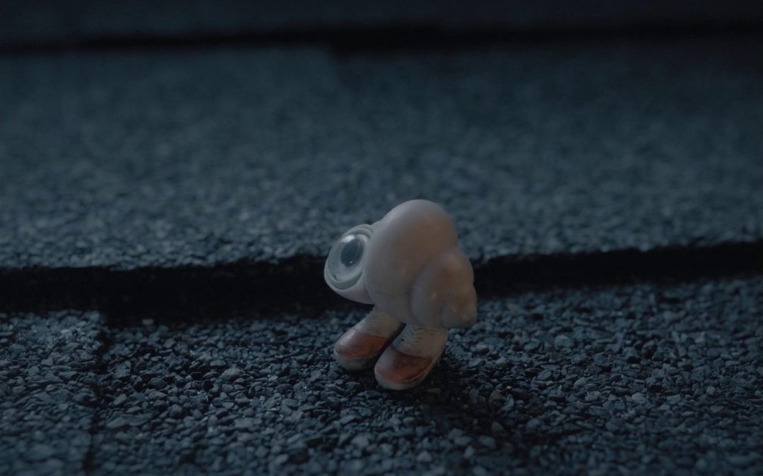
In this playful ad campaign for Arco gas stations, we brought to life Hanna the Dashboard Hula Girl and her team of brilliant scientists as they invented a delightful “rewards” system hidden within the gas pumps, transforming a mundane refueling experience into an enchanting journey.

Over the course of four weeks, the team at Ancient Order of the Wooden Skull meticulously crafted miniature sets that captured the intricate inner workings of a gas pump, infused with a captivating industrial design flair.

Each detail was a labor of love, blending whimsy and creativity to invite viewers into a world where every fill-up unlocks a little magic and joy.

arco_poster
arco_top3_03
arco_top3_02
arco_top3_01

Rewards Matrix

arco_matrix_featured_01

Assembly

The assembly of the Rewards Matrix set was a thrilling journey through creativity and resourcefulness, as I brought together an eclectic mix of 3D-printed components and found treasures sourced from the local electronics store. With a vision to capture the essence of an industrial gas pump, I meticulously crafted each piece to evoke a sense of gritty authenticity, complemented by tubes filled with rich amber gasoline that pulse with energy in the background.

The entire set gleams with a metallic chrome finish, reflecting light and adding to the illusion of a bustling, high-tech environment. This playful endeavor not only challenged my skills but also ignited a sense of wonder, as I transformed everyday materials into an enchanting visual narrative.

Black Paint

As I watched everything transform into a deep, matte black before the final chrome finish, I couldn’t help but marvel at the striking contrast it created against the vibrant hues of the sandy backdrop. The subtle textures and shapes, cloaked in shadow, revealed an unexpected beauty that was almost mesmerizing.

Each piece exuded a sense of mystery and depth, making me momentarily wish we could pause time and celebrate this captivating phase before the gleaming polish took over. It felt like a playful dance between dark and light, a visual exploration that stirred my imagination and invited endless possibilities.

Close Up

As you explore the intricate details of the Rewards Matrix set, you’ll find a captivating array of machines and gas tubes that invite curiosity and awe. Each close-up photograph reveals the thoughtful craftsmanship behind every knob, bolt, and tube, showcasing the delicate balance between function and whimsy. These elements, meticulously assembled, contribute to a visual narrative that transforms the ordinary into the extraordinary, embodying the spirit of innovation and playfulness that defines our project. The gleaming surfaces and intricate designs invite you to imagine the stories behind this vibrant world, where each detail serves a purpose in the enchanting experience we sought to create, making the mundane act of refueling a delightful adventure.

Shoot

Amidst the chaotic energy of the set, the Arco commercial shoot unfolded like a whimsical adventure, where we dove into a fantastical world hidden within a gas pump, filled with surprises around every corner. The excitement was palpable as massive camera rigs soared through the air, weaving in and out while we made quick adjustments, transforming our envisioned scenes into vibrant reality.

As the lighting team breathed life into the miniature set, illuminating every carefully crafted detail, I felt a sense of awe watching Hanna the Dashboard Girl sway in sync with the rhythm of the production. Each moment was infused with joy and creativity, a reminder that even the most ordinary experiences can be transformed into something extraordinary with a touch of imagination and teamwork.

Fusion Reactor

Step into the world of the Fusion Reactor, a stunning creation by George Metaxis that seamlessly marries art and engineering. This remarkable set features large reactors designed to fuse objects in a mesmerizing display of innovation and craftsmanship. With each intricate detail meticulously crafted, the fusion of form and function draws your gaze, inviting you to explore the captivating mechanics behind this site of wonder. As the reactors hum with energy, they transform the ordinary into a realm of limitless possibilities, evoking a sense of awe and curiosity about the alchemy of creation. Here, imagination meets reality in a vivid testament to the power of artistic vision and technical prowess.

Fuel Testing Lab

Welcome to the Fuel Testing Lab, an ingenious creation by Greg Pinsoneault that brings the world of scientific experimentation to life in a captivating way. Imagine the thrill of watching a real working conveyor belt, humming with energy as it transports ideas and innovation. This unique space features an elaborate funnel system, where vibrant apple juice flows through transparent tubes, playfully mimicking the look of gasoline traversing through tanks. With every detail meticulously designed, the lab becomes a playground of imagination, inviting you to explore the seamless blend of artistry and engineering while celebrating the whimsical spirit of invention that fuels our journey.

Command Center

Step into the vibrant heart of imagination with the Command Center set, a captivating marvel brought to life by Jed Voltz, where creativity knows no bounds. This grand centerpiece showcases an intricate design brimming with energy and excitement, highlighted by the dramatic drop of a shimmering disco ball that encapsulates the spirit of celebration and adventure. As the backdrop for Hanna the Dashboard Girl’s escapades, this set weaves together whimsical elements and meticulous craftsmanship, inviting viewers into a dynamic world where fun and functionality collide in a dazzling display of artistry. Each corner of the Command Center whispers stories of innovation, beckoning you to explore a universe where the ordinary becomes extraordinary and every detail is a testament to the magic of storytelling through design.

Painting

Amber Padgett took the lead as the painter on this ambitious project, rallying her team to breathe life into every set with tireless dedication and an eye for detail. They transformed each piece through a meticulous spray-painting process, ensuring that every brushstroke gleamed with shiny perfection. The effort culminated in a vibrant display that not only showcased their artistry but also captured the essence of the imaginative world created for the Arco campaign, turning each set into a visual feast that harmonized creativity and craftsmanship.

The Shoot

As the cameras rolled, the atmosphere was electric with anticipation, where each shot captured the vibrant spirit of our meticulously crafted miniature worlds. With laughter and collaboration as our soundtrack, we embraced the challenge of bringing Hanna’s Rewards Center to life, transforming our imaginative designs into a playful reality. It was more than just a shoot; it was a delightful dance of creativity, where the convergence of art and film harmonized to reveal the enchanting stories hidden within the gas pump, reminding us that each frame holds the potential for magic and wonder.

Shape Island

Shape Island

Shape Island

Art Dept Manager | Model-Maker

Bix Pix Entertainment | Apple

2021-2022

Project Synopsis

Based on the beloved series of children’s books by Jon Klassen and Mac Barnett, “Shape Island” takes us to the whimsical land of three shapes: Triangle, Circle, and Square, as they explore their home and learn more about each other.

As a fan of Klassen & Barnett’s work, I was extremely excited to come on to this project. As a model-maker, I got to create beautiful props for the titular shapes. I wore many other hats throughout the production: set builder, terrain expert, prop master, and set dresser, to name a few.

Halfway through the show I became the Art Dept Manager, keeping track of the upcoming shots and communicating to the Art, Puppet, Animation and Rigging departments, staying ahead of our production timeline.

Shape Island Poster
shp_space_screen01
shp_triday_screen01
shp_beach_screen01

TERRAIN

shp_terr_screen02

"GROUNDS" MASTER

At the start of this production, I was put in charge of testing various methods to create the natural terrains of the entire show. This was a fun time of experimentation. There are a lot of tried and true ways that we use in stop motion to achieve certain looks, but they can sometimes start to look rote. We wanted to challenge ourselves to try something new, and make the “normal” things to be made in a totally new way.

For example, we experimented with using dyed wood chips and sawdust for our grass textures. I was in charge of the early tests to determine the proper look and scale of this important terrain texture. In the end we ended up using a combination of both, dyed green and yellow, to achieve the grass at various different scales.

EARLY SAND TESTS

The shapes spend a lot of time on the beach and other sandy environments. The perks of living on an island! It was important to nail down the specific look of the sand early on, because it was going to be used throughout the show. I did a lot of experimentation dying sand various colors to see if we wanted to go for an impressionistic look. We even experimented with a very painterly look, trying to blend different colored sands together to create gradients on the ground.

THE GROUND

In the end, we usually covered the ground in natural sand and painted over it. But those tests were a proving ground and we ended up using a lot of the lessons learned in other aspects of the production!

I ended up gluing and coating most of the sets with sand due to my familiarity with the material. We opted for a very light coating, which meant I had to be careful in applying it to not get any area with a very obvious seem. This usually meant rotating entire foam set sculptures to let gravity do most of the work while the white glue and water mixture harden. Most of this was done outside in the middle of summer, so I didn’t have to wait long for the glue to set up!

ADDING DIRT AND GRASS

We had a lot of sets that required integrating dirt & grass onto the side of a mountain. The foam-carved set would get coated and painted with a rock texture, and then come to me for the terrain treatment. The process was fun because it had to be done in stages: applying the dirt, aging the dirt, adding and feathering out the grass, and finally adding any wood chips to fill in the corners of the set, imitating overgrowth in the forgotten corners of this nature path. The set dressing team did an incredible job adding the paper-cut carstock grass and fern elements. All of these pieces brought the environment of Shape Island to life.

sph_grassgrnd01

The naked (only paint) mountain path set

sph_grassgrnd02

Adding the fine dirt

sph_grassgrnd04

Feathering in the grass and adding ferns

The Mountain Path

All the little details coalesced on sets like these to create a natural environment that really felt lived-in, while adding a feel of a natural world that had been there long before our characters existed.

The tree in this shot had to have roots sculpted out of clay, and painted to integrate with the tree trunks. This was particularly challenging because there was a big time crunch to get the set launched. Half of the job in art department is working against the clock!

I’m very happy with the final result. We always challenged ourselves to get our sets to look both beautiful and natural, in that same way that nature itself is often chaotic and harmonious all at once.

sph_grassgrnd05
There was always something shot-specific we’d have to add after the fact. I built, molded and cast this rock-pile banister for a shot when Circle is running up the hill. We worked hard for the set dressing on Shape Island to look like they all came from the same world of natural, found objects.
sph_grassgrnd06

The rock pile banister, seamed together with clay and small pebbles

sph_grassgrnd08

We didn’t install the entire banner – the camera was never going to see everything!

SET BUILDS

shp_lake_screen01

THE WATERFALL

The Waterfall was the first set on Shape Island that I took all the way from start to finish. Starting with the initial foam carving, to coating the surface with our dense expending foam, and continuing on into a round of plastic coating and terrain texturing, this one truly felt like i out my signature on it.

I also spent a decent amount of time figuring out how to do the water in the pond, and rolling down the mountainside. The waterfall itself is number of delicately poured, built-up layers of clear resin, combined with some lighting and VFX magic to make it appear in motion. The pond was a large piece of clear acrylic sheet, cut to fit exactly in a deep divot of the carved foam. We then painted to underside of the acrylic, to give it the illusion of surface depth.

The Set Dressing Team

On top of the incredible builders we had in the set shop, our on the floor we had the incredibly talented dynamic duo of Alexandra Steele and Bismak Fernandes putting the final, incredibly important details onto the set. The set dressing team is responsible for adding the finishing touches, and making sure everything looks super good in camera. These two worked tirelesly and with great dedication to install foliage, vegetation, tree, blocks, and everything else to breath life into this make-believe island.

shp_wfall08

The Dream Team: Alex & Bismark

shp_wfall09
A dense forest with set dressing galore!
shp_wfall10
The forest bridge
shp_terr_screen03

THE WINDING WOODS

Circle gets lost in the Winding Woods trying to chase down a rogue gopher. We had to come up with an ingenious solution for a set that would sell the idea of a densely-packed forest where you could feasibly lose your way, while also keeping the build parameters to a minimum. Our Art Director Jeff White’s solution was to create a kind of “Infinity Path” – a large elliptical path that wound back on itself. A berm on the inner part of the set made it so you’d never be able to see the other side of the path. This made it so we could film from a lot of different angles, and no part of the path would ever look exactly the same as another.

I was tasked with mocking up and building the infinity path. Another clever modification on this set: the top of the berm was designed with a puck in the middle, so it could come out and have extra trees planted inside of it (for the shots where the forest needed to appear even more dense than normal). There is also a separation point in the middle of the set, so it could be taken apart after shooting out our wide shots. This meant it could be used on two separate stages to shoot out our close ups and insert shots, doubling the amount of footage we could animate in a week.

shp_beach_screen01

BEACH HANGOUT

The Beach Hangout is a special part of the island, and an important set for the show. The Shapes share hot chocolate there, watch sunsets and sunrises there, picnic and cavort there. The challenge with this was to make it iconic, by keeping it very simple, but just decorated enough to breath life into the relaxing beach setting.

The lightly undulating sand is coated with a salmon pink and then coated with a brilliant white coat of sand, giving the beach a shimmering quality. Combine that with a few well-placed, elegant palm trees and some massive rocks to break up the background composition, and you’ve got the makings of an iconic setting where anything can happen.

TREE TRUNKS

Most of our trees were skinny enough to be constructed out of a packing tube base or even a simple dowel rod, but some had to be massive to sell the scale of an old-growth forest. I carved these large tree trunks by cutting a MDF (medium-density fiberboard) templates, covering it with aluminum tape on the edges, and using them as a guide to cutting the shape out of 12″ diameter foam cylinders with a hot wire.

shp_trunk03
shp_trunk02

PROPS & MODELS

shp_circhome01

FOUNTAIN IN CIRCLE'S HOME

The fountain in the center of Circle’s home beneath a waterfall was a great centerpiece to fabricate. As a centerpiece to the whole house, it was important to make it feel cozy and secore.

After the mock-up phase, I created the fountain’s outer wall by building up layers of MDF and covering up the cracks with bondo. Inside the center is a mirror that we sprayed with dullcote and added a 1/2″ piece of plexiglass on top of. The tree is constructed from dowel rods and armature wire, with bondo filling in the cracks.

shp_bg04

BOARD GAME

Throughout the production, I was relied upon for my exactness on paper craft projects. Taking art created by Joseph Berryhill, I meticulously folded, glued and cut the pieces to the space-themed board game that is a central part of this episode. I also prepped the 3D-printed board game pieces with spray paint. The box itself has a top that can open, and is rigged so characters can handle it without ruining the box. It took a lot of trial and error to get the paper just right, but it was well worth it. I sometimes wish this was a real game so I could play it!

shp_bg06
shp_bg08
shp_bg01

Beauty shot of the Board Game Box

SET DRESSING

shp_sqrlnd01

SQUARELAND

Square’s part of the island was one of my favorites. It was a unique challenge to make a bunch of cubes look unique and interesting, but Production Designer Paul Harrod found the way to do it. I was lucky enough to help dress the set a number of times for Squareland, which involved a lot of intricate planning. We worked hard to make sure everything looked like it was embedded in the sand, like every cube had been on the beach for a long time, like ancient ruins.

CIRCLE'S GARDEN

The garden outside Circle’s cave was one of the most beautifull we got to create. By the time it was first seen on camera, so many of our artists had contributed to it. It was a truly collaborative project, requiring everyone’s skills to bring to life. Carpenters, sculptors, mold-makers, prop-fabricators, painters, and set-dressers all had something important to bring to this unique set.

I contributed to the garden’s grass and dirt mounds, working diligently and with a steady hand to create the well-manicured oasis.

shp_garden_screen01

NICE HILL PARTY

This introduction to the episode “Triangle Day” was a cute little prop-fabrication assignment for me. Even small scenes like this one have lots of planning put into them! I was in charge of dressing the table, creating the flag banner above the table, and creating the transition from beach sand to grass. Yet another example of the care and attention we put into every single set.

shp_hillparty01
shp_hillparty03

Working on the banner

shp_hillparty04

The finished, dressed table

shp_hillparty05

Note the tiny puck of beach sand in the corner

BEHIND THE SCENES GALLERY

TRAILER

Marcel the Shell with Shoes On

Marcel the Shell with Shoes On

Marcel the Shell with Shoes On

Art Coordinator | Concept Design

Chiodo Bros. Productions

2020

Project Synopsis

In the beginning of 2020, I was asked to join the team producing a small independent movie based on Marcel the Shell, who I knew from the adorable YouTube shorts.

To introduce us to the project, some of the new hires and I were invited to watch the animatic. It had no animation, no visual effects, the roughest of rough storyboards, and no music, not even a temp track.

We all bawled our eyes out. We knew we were about to work on something special.

marcel the shell poster
shp_space_screen01
shp_triday_screen01
shp_beach_screen01

Design Projects

StockpileRoom_Screenshot1

STOCKPILE ROOM

While on the show, I also got opportunities to design some of the sets that needed to be created. I put a lot of effort into getting the Stockpile Room right. I knew it wasn’t just a place where I could shine, but the art team who executed it as well.

Final Design

We arrived at the final design of the Stockpile Room after a lot of back and forth and various iterations. We really wanted to make sure it had a photo-real quality so the Director could get a feel for what we were trying to fabricate.

I took copious reference photos to craft the feel of this room. We had a lot of fun imaginging the details in Marcel’s little wall nook.

MTS_StockpileRoom_EK_v3

PLANTER BOX MANDALA

After a particularly emotional moment in the movie, Marcel constructs a memorial in the planter box outside the house’s window. I was tasked with imagining some options for what it could look like, using only the fruits, vegetables and plants we had already created casts of. I usually illustrate my designs, so it was a fun challenge switching over to a realistic photo manipulation style.

Final Build

Designing the planter box mandala was a delightful journey of creativity and collaboration, where each piece felt like a tiny heartbeat adding to the overall rhythm of the design. As I envisioned the intricate layout, I had the joy of meticulously choosing and positioning each fruit, vegetable, and plant, watching my ideas blossom into a lively tribute that mirrored the emotions of the moment it represents. It was a fulfilling experience to see the thoughts and intentions materialize, transforming a simple planter into an enchanting centerpiece that encapsulated the essence of the story and the beauty of togetherness.

Marcel_PlanterBox_BTS01a

FAMILY TREE VANITY

Designing the family tree that adorns Marcel’s vanity was a touching exploration of connection and memory, as I envisioned how each delicate branch could represent a cherished family member. With careful attention to detail, I imagined the pot as a sturdy foundation, symbolizing the love that anchors Marcel’s world. The task allowed me to breathe life into every aspect, from the intricate etchings that tell stories of joy and resilience to the placement of each character, creating a visual narrative that resonates with the heart. It was a privilege to weave together these elements into a heartfelt tribute, transforming the vanity into a meaningful reflection of Marcel’s lineage and the bonds that shape him.

MATCHBOX

In crafting the matchbox designs for Marcel the Shell, I tapped into a playful yet meticulous creative process within Photoshop, where the challenge was to create visually authentic matchboxes that appeared entirely brandless, evoking a sense of nostalgia and charm. Each iteration began with careful sketching and experimentation across a palette of color options, striving to capture the essence of real matchboxes while ensuring they blended seamlessly into Marcel’s world.

Art Coordinator

artcod05

As an art coordinator in the field of stop motion animation, my role is dynamic and exciting. From keeping track of upcoming shots to ensuring artists stay focused, I am the glue that holds the creative process together. I am responsible for ordering necessary supplies and ensuring the art director is well-informed about upcoming projects. With a keen eye for detail and a talent for organization, I help bring the director’s vision to life.

NANA CONNIE’S BEDROOM VANITY

In dressing Nana Connie’s bedroom, I sought to capture the warmth and nostalgia reminiscent of every cherished grandmother’s home, where small, everyday vanity objects intertwine to weave a story of love and comfort. The carefully selected trinkets—a vintage jewelry box, delicate porcelain figurines, and whimsically arranged hairpins—transform the space into a sanctuary of memories, each item inviting a smile and a gentle sigh. Softly lit by the glow of a thoughtful table lamp, the room embraces visitors with its pastel colors and lovingly worn fabrics, creating a sense of belonging that feels like a hug. Every corner whispers tales of laughter and wisdom, while the playful touches of everyday items remind us that beauty can be found in the simplest of moments, making Nana Connie’s bedroom not just a space, but a heartfelt reflection of family and legacy.

LAPTOP KEYBOARD

As Marcel navigated his miniature landscape, the quest for the perfect match for his MacBook keyboard unfolded like an adventure in itself, filled with unexpected interactions and delightful discoveries; the vibrant colors and textures of the surrounding environment served as inspiration, each keystroke resonating with the essence of his tiny world.

DUST TABLE

As we embarked on creating the enchanting ice-skating scene, my dressing team and I found ourselves in a delicate dance with dust, meticulously sprinkling just the right amount across the tabletop to evoke the illusion of shimmering ice. Each application required a gentle touch and an artistic instinct, as we deftly balanced the amount of dust to capture the perfect ethereal quality that would complement Marcel’s delicate world.

With every layer we added, we were not merely setting a scene; we were crafting a visual symphony that resonated with the heartwarming moments unfolding on screen, ensuring that every detail transported the audience to the whimsical charm of Marcel’s universe.

TRAILER

Alien Xmas

Alien Xmas

Alien Xmas

Art Coordinator | Visual Development Artist

Chiodo Bros. Productions

2019

Project Synopsis

“Alien Xmas” is the story of an alien named X who wants nothing more than to prove himself to his kleptomaniac peers. But when he gets in over his head trying to steal all of Santa’s toys, he inadvertently learns the true meaning of Christmas.

Because of my robust knowledge of the material needs of a Stop Motion project, I was brought on board this project to serve as the Art Dept Coordinator. Then I was able to put my illustration skills to work. I designed sets, models and props for the project, combining the alien science-fiction aesthetic with the warm elements of Christmas.

Alien Xmas Poster
shp_space_screen01
shp_triday_screen01
shp_beach_screen01

Visual Development

StockpileRoom_Screenshot2

Final dressed set

KLEPT PLANET

As one of my first major environment design assignments, I got to spend a lot of time tweaking and perfecting what the Klept Homeworld would look like for the opening prologue of the film. We wanted it to feel barren and sad, a place where all good things had been destroyed by the Klepts’ greed. I loved the way the rest of our team translated my designs into the final set.

HERALD HORNS

alienxmas-screeshot-klepthorns

Horn props used in the opening scene

This horn is intended to herald in the coming of Z, the evil alien leader. We wanted to incorporate sharp pointy teeth into the design, which fit in nicely with the comically oversized scale. I was particularly proud of this design, especially since model-maker Josh Spooner did an incredible job translating my design almost exactly.

SPIDER CHAIR

The leader of the Klepts, an alien matriarch named Z, has some really awesome props associated with her. I designed her Spider Chair, which was fun to imagine. I also designed her staff, which had a very “Dark Crystal” feel to it.

Z_SpiderChair_vFinal

Design for the Spider Chair

SHIP CONTROLS

We wanted to add a bit of whimsy, and imagined the flight controls on the alien spaceships to have flight sticks that imitated video game conrollers. The final version ended up close to traditional flight controls, but the explorations into game controls proved useful.

EK_Klept_Controller_Square

My final prop design for the Herald Horn

EK_Klept_Controllers_v1_green

Horn props used in the opening scene

SANTA’S BAG

AX_WSP_SantasBag_v1a_EK
AX_WSP_SantasBag_v1b_EK
AX_WSP_SantasBag_v2_EK_web

SANTA’S WALKIE

AX_XTN_SantaWalkie_v2_EK
AX_XTN_SantaWalkie_v1_EK
SantaWalkie_GregP_Fab

The final prop, fabricated by the incomparable Greg Pinsoneault

CHRISTMAS WEAPONS

The Christmas weapons were fun to design, trying to conceptualize how wrapping paper would come out of a gun. My experience fabricating helped me think through these weapons and how they would be put together.

SANTA’S TOY FACTORY

In the world of Alien Xmas, toys are not so much hand-crafted as they are manufactured in a fun toy factory. The conveyor belts and various building mechanisms were great to imagine, and I was excited to see it coming together once it started being built.

LANDING SHIP

Z’s Pod went through many variations. It needed to be scary, but not too scary. Finding the right middle ground with the shape language proved to be a stimulating challenge.

SPACESHIPS

Even though this design wasn’t used for the final build, I had a great time conceptualizing all the pieces that needed to come together.

For one thing, we wanted the sihouette to look like a Christmas Tree. Building off of that, we wanted the Fighter Pods (which were designed to look like Christmas ornaments) to be able to dock in a way to look like they were hanging off of the ship’s “branches.”

The final ship was given life by our great model-maker Franco. Every artist gets to contribute something on a production like this.

AX_Klept_FighterPods_v2_EK_web
AX_Klept_FighterPods_v3_EK
AX_KleptMothership_11x17jpg_EK

CITYSCAPES

For the final scenes of the film, the Klepts travel the earth to spread Christmas cheer. We needed to conceptualize single images of major cities that could read as iconic very quickly. These would get turned into sets that exagerated the famous aspects of those cities. Working quickly, I used a lot of photo-manipulation to get the concepts where we wanted them. I’m still proud of the final results.

Picking the landmarks was a fun challenge. Luckily, we were told we did not need to be scale-accurate, so we figured we could really have a bit of fun.

AX_ParisLayout_EKpass
AX_NewYorkLayout_EKpass
AX_LondonLayout_EKpass

Art Coordination

As the Art Coordinator, I was responsible for running the shop while our Art Director, Jeff White, was away. This happened frequently once we began shooting, as our production stages were in another building 10 minutes away. 

This gave me a sense of leadership in my role which I happily took upon myself. Among my other daily responsibilities included managin assignments to the model makers and set builders, doling out jobs and runs to our production assistants, and keeping the supplies ordered for the shop to run smoothly. I got to act as the art departments eyes and ears for upcoming builds, attempting to keep us one step ahead of a constantly evolving project.

TRAILER